


Te Oraka Shirley Intermediate (Brand)
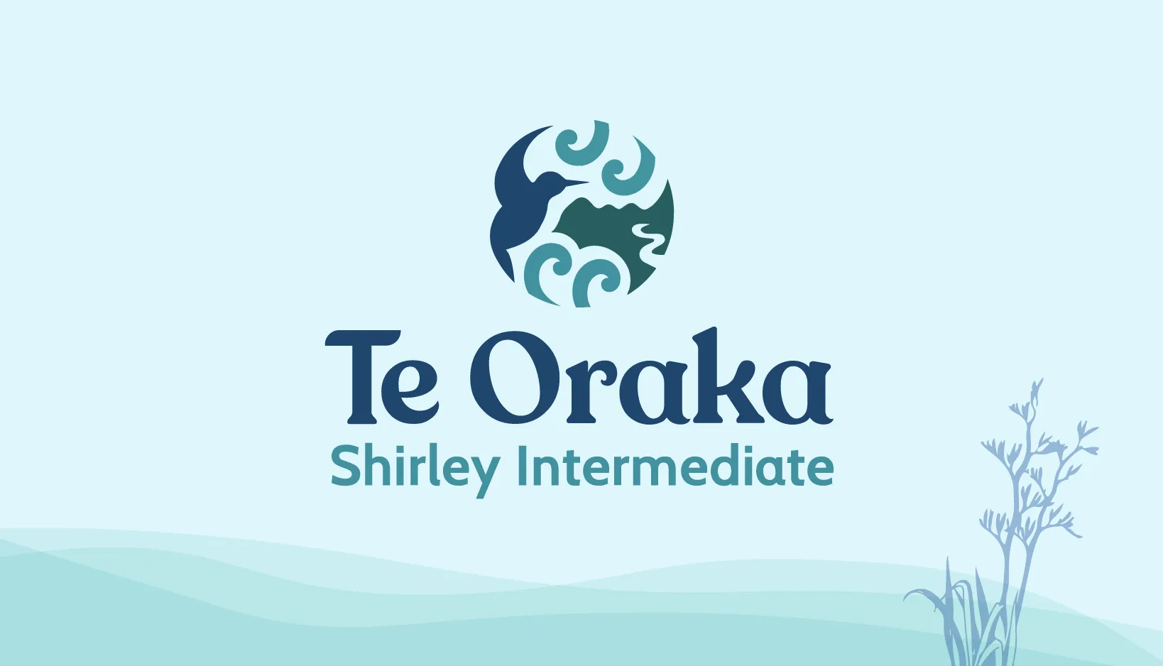
Where futures take shape
Title BOLD

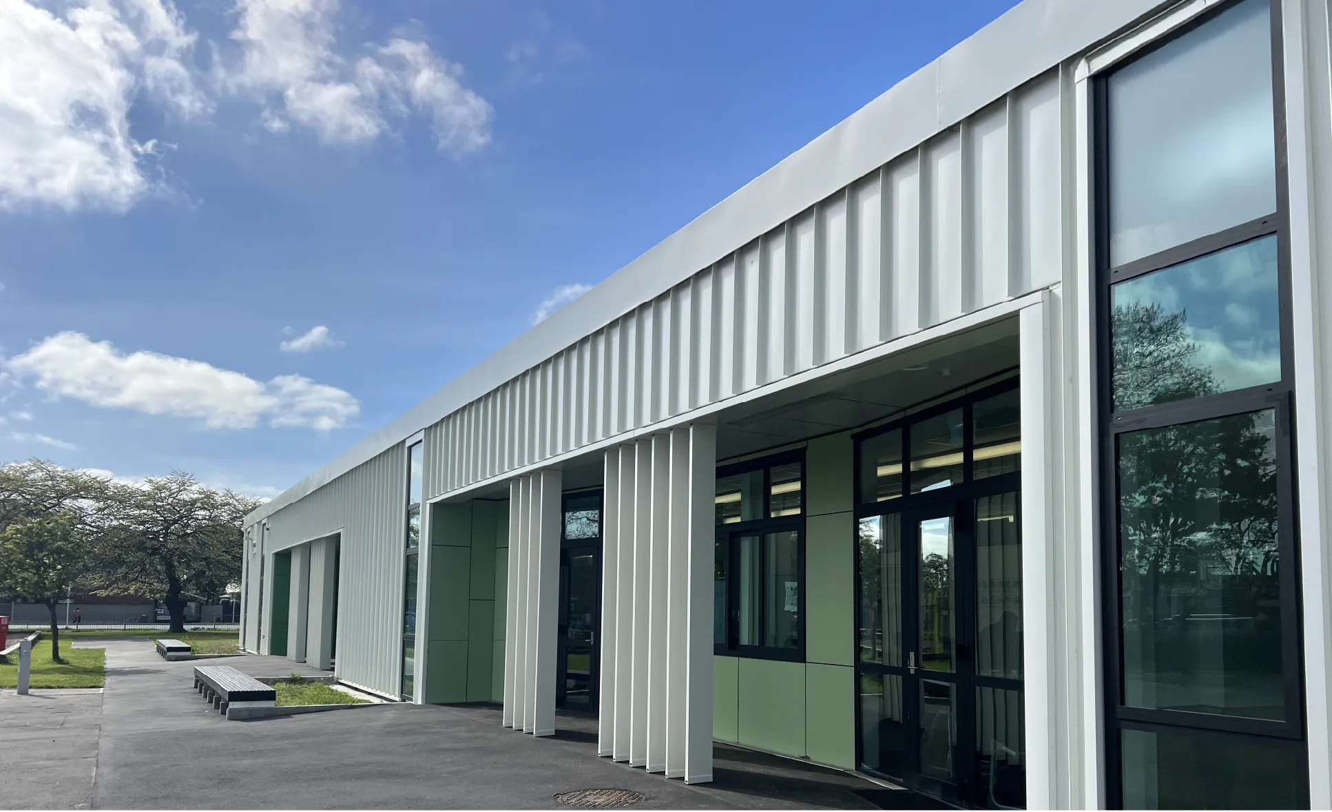
We were privileged to partner with Te Oraka Shirley Intermediate to develop a refreshed brand identity, a strategic piece of work designed to amplify their unique story and shape their future. Our mission was clear: create an identity that builds on their strong foundations, their cultural narrative, Graduate Profile, and kura values, while giving them a distinct voice in the local educational landscape. The brand needed to be future-focused, grounded in values, and reflective of the community, fostering pride and a strong sense of belonging among ākonga, whānau, and kaiako.

Read more
Services
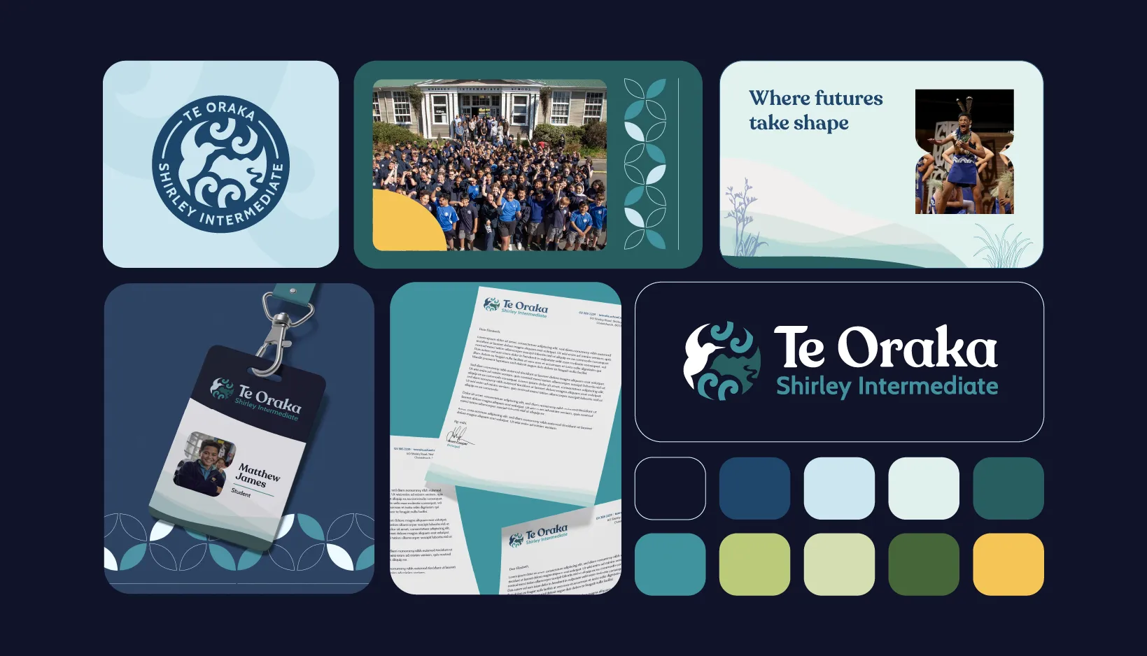
Project highlights
Refreshed Te Oraka Shirley Intermediate’s brand to reflect its values, culture, and future vision.
Developed a distinctive visual system that stands out while fitting seamlessly across the school.
Designed a meaningful icon and flexible identity that brings “Where futures take shape” to life.
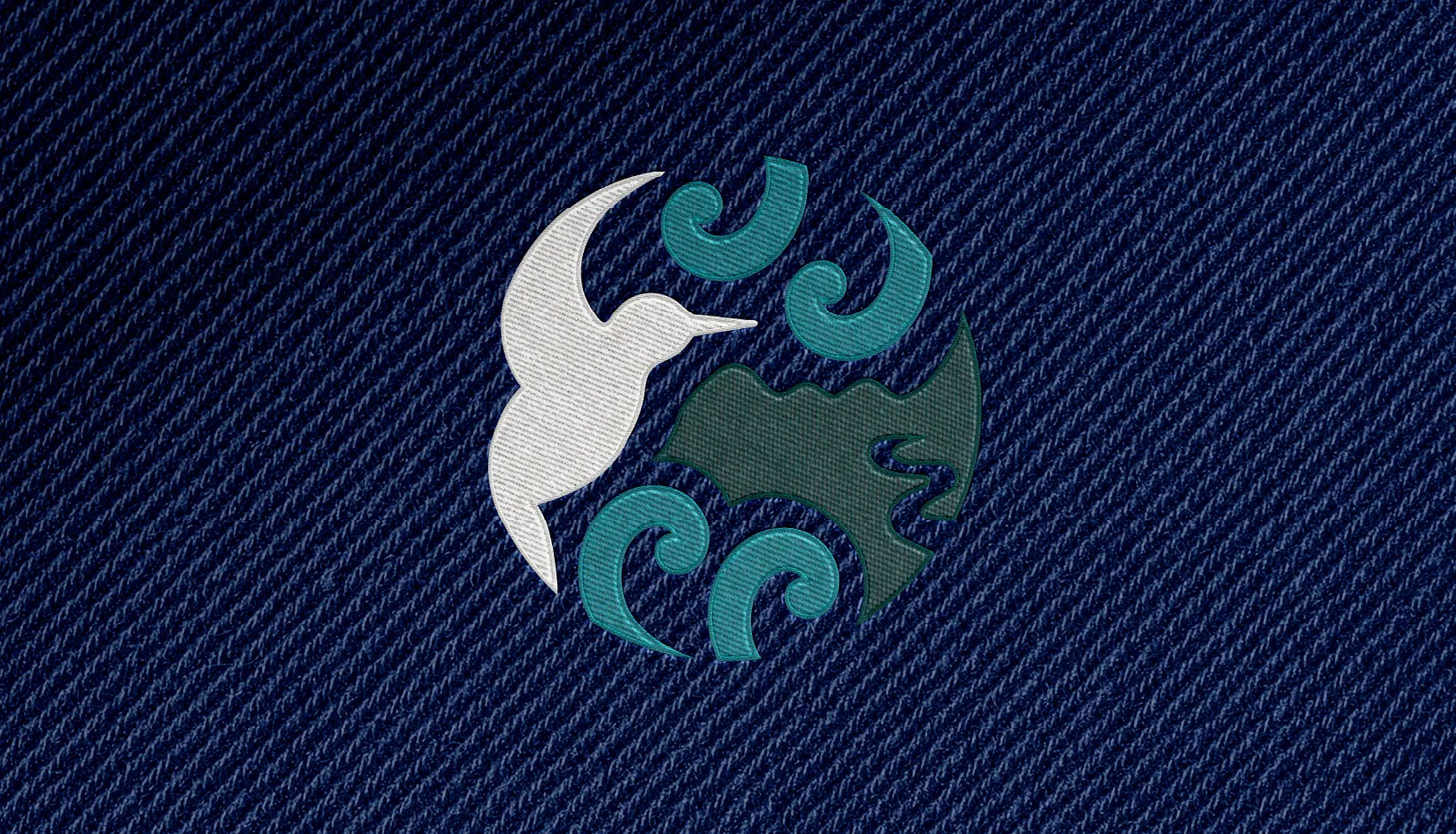
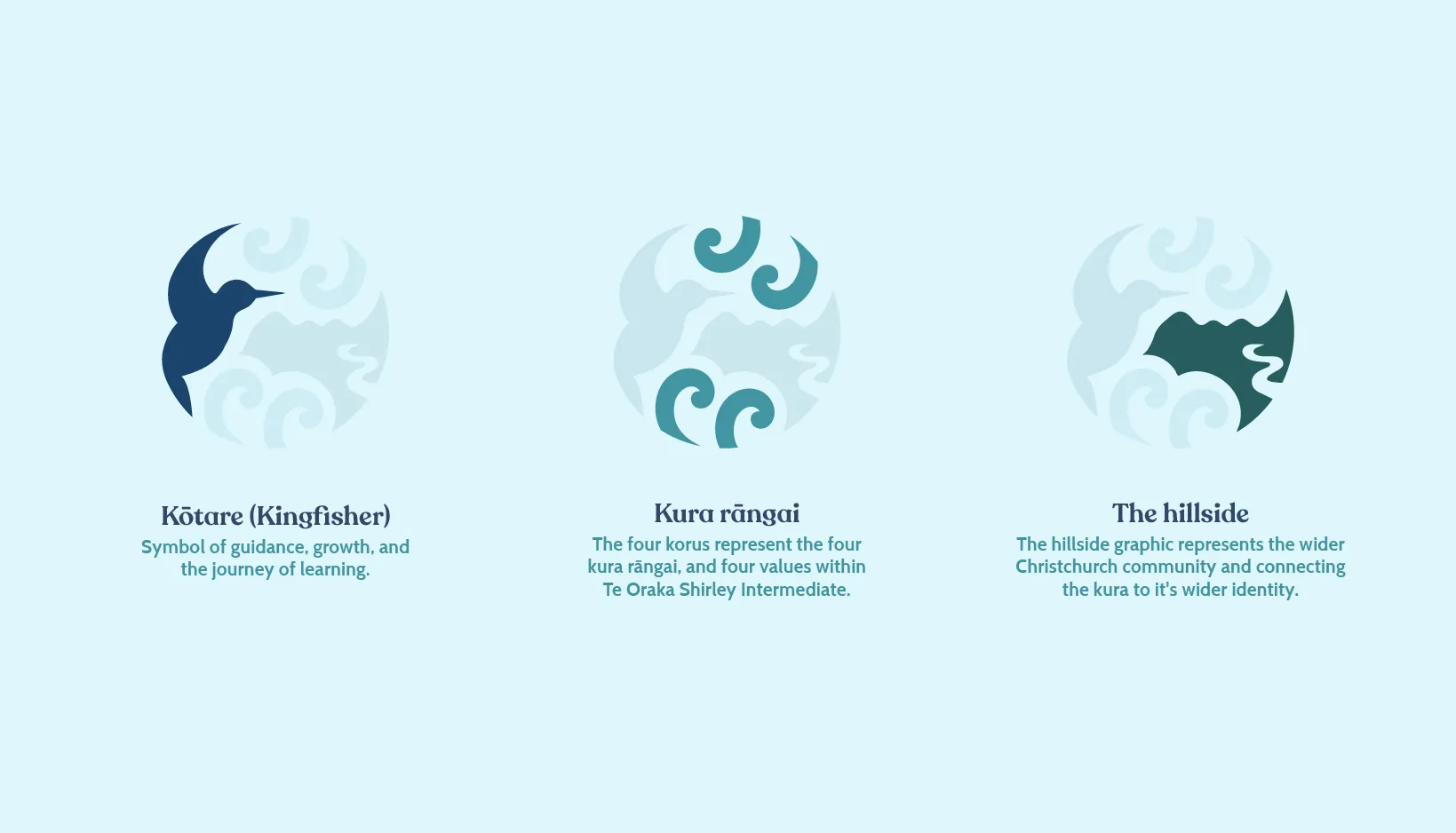
We crafted a unique icon that intertwines multiple layers of meaning: a Kōtare (Sacred Kingfisher) in flight (symbolising guidance and the journey of learning), four mirrored Koru (representing the four kura rāngai and four core values: Manaaki, Auaha, Kotahitanga, and Kaitiaki), and graphics nodding to the local Port Hills and waterways.
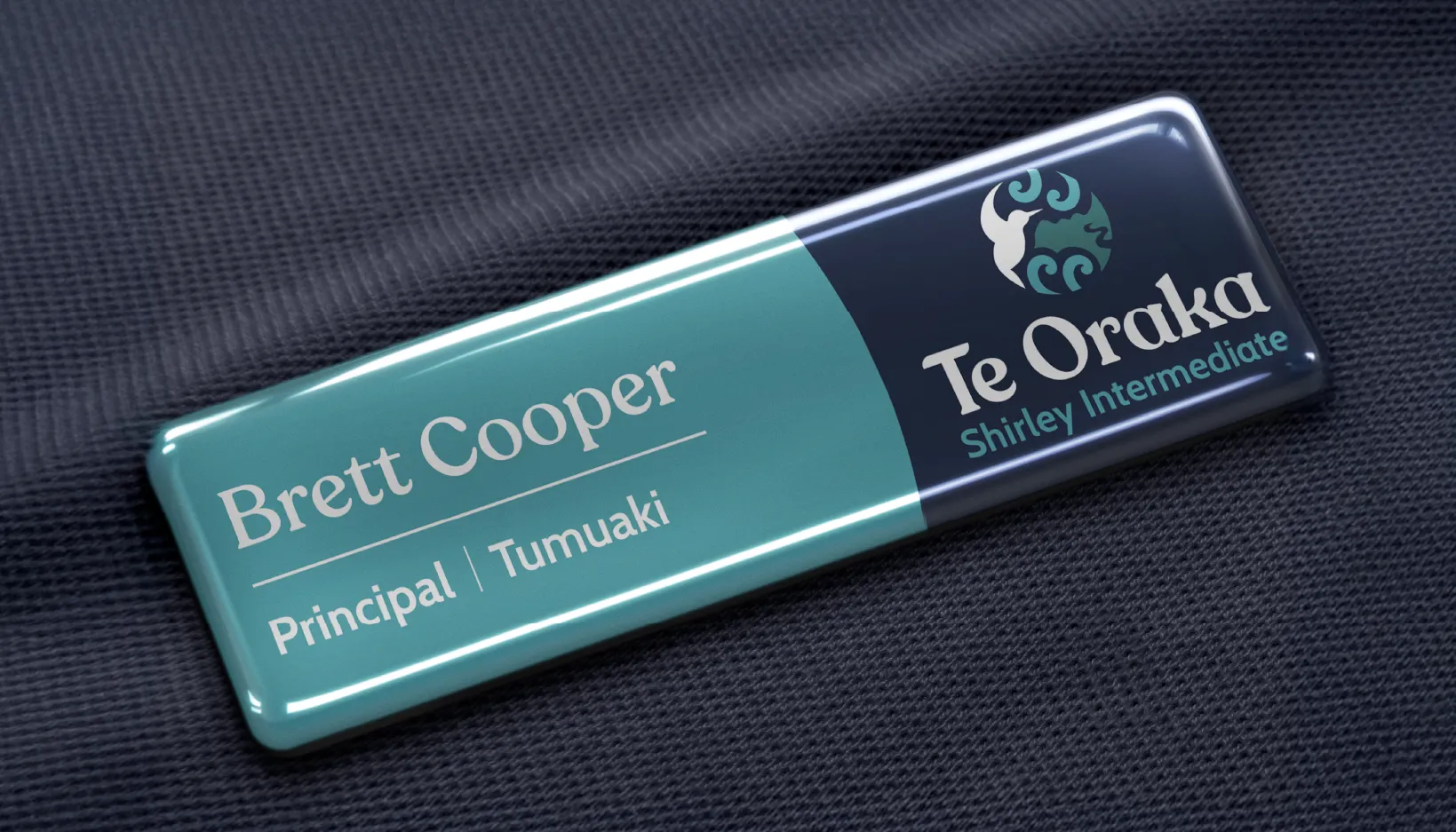
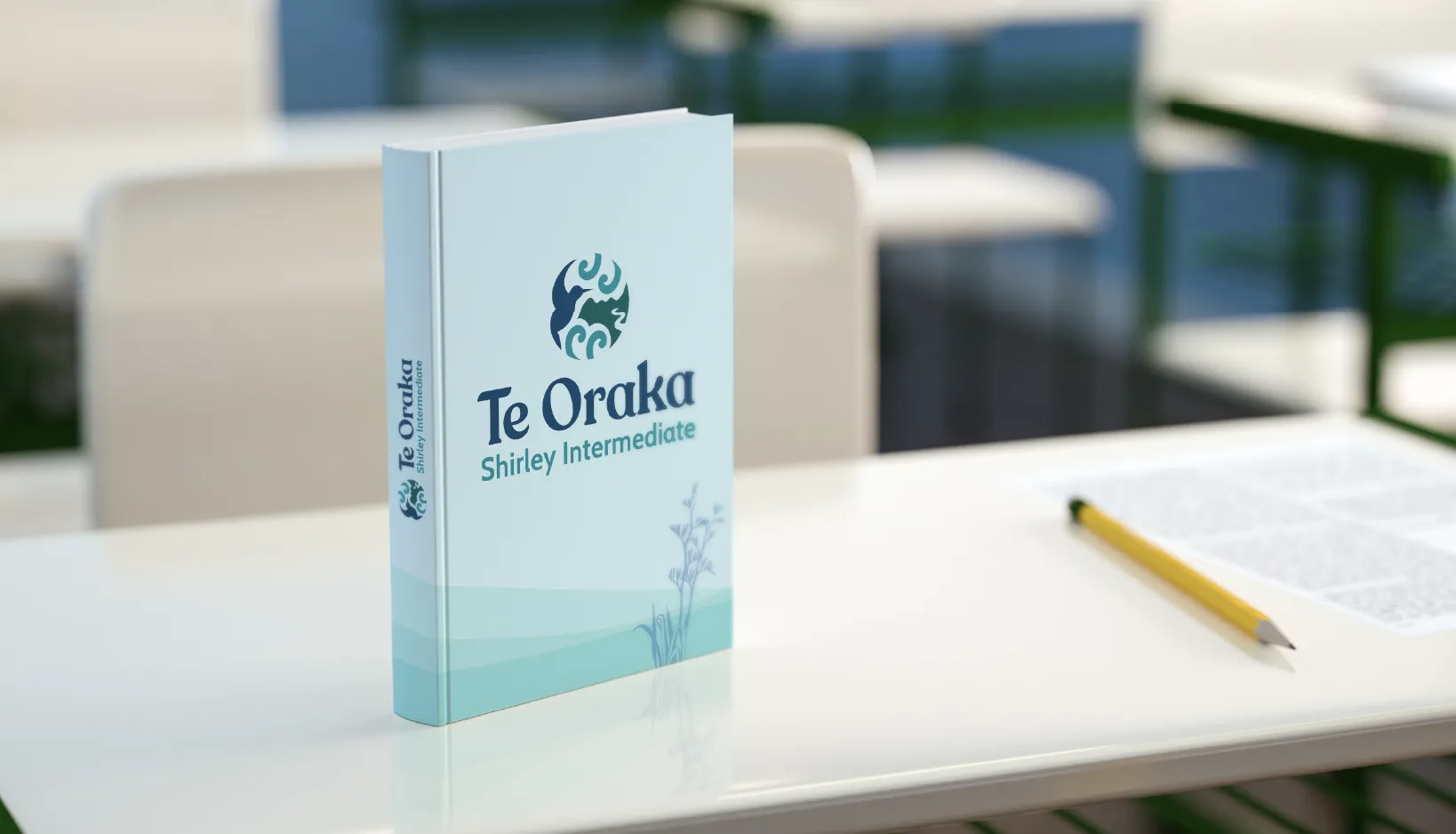
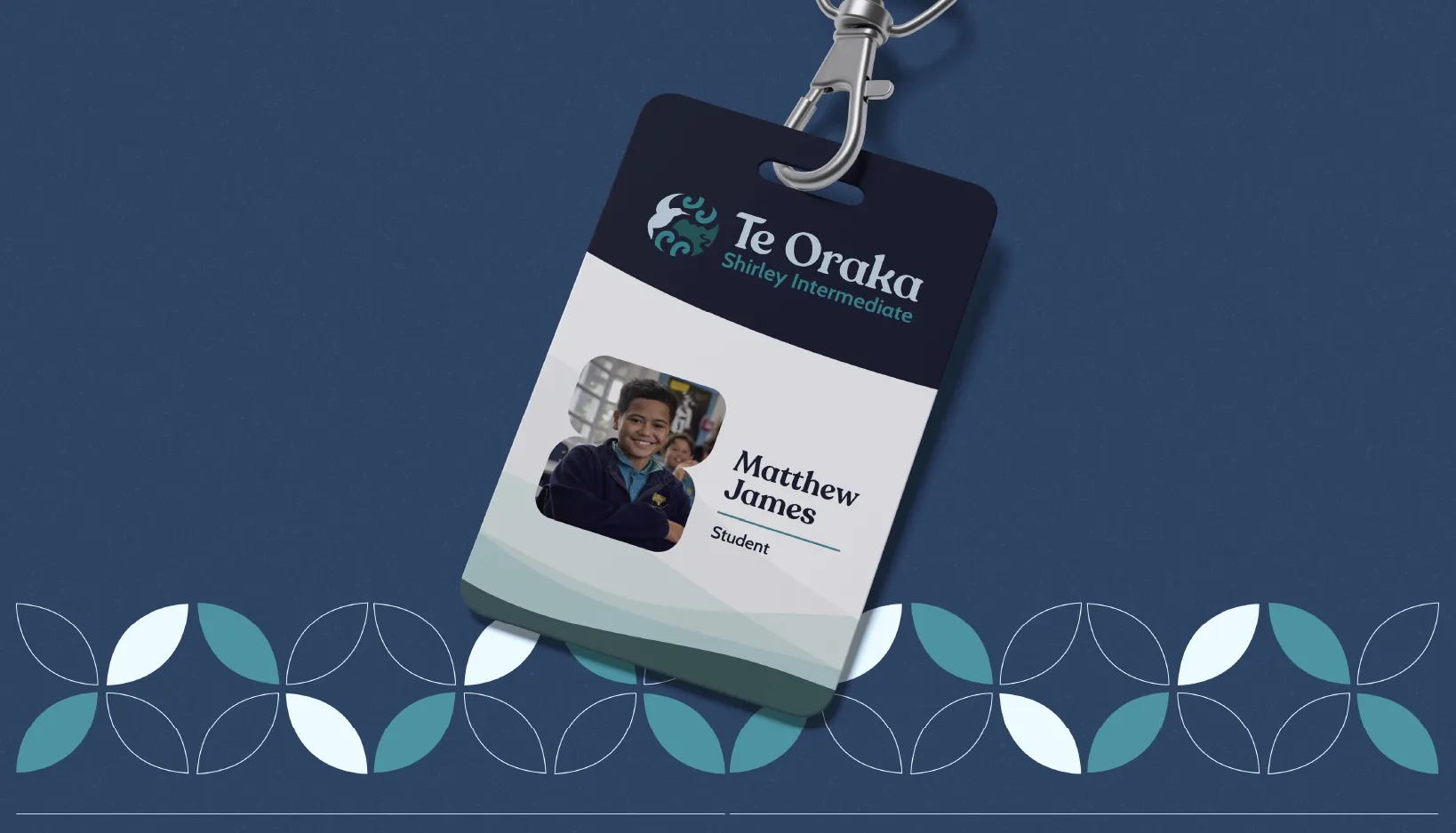
The result is a system that works across every touchpoint, from social media to merchandise to physical signage, allowing Te Oraka Shirley Intermediate to proudly shape the futures of their ākonga.
"Getting specialists in to do a job is a step above what you'd usually get. You want something that you're proud of, and the response from others reinforces that it was worth it."
Brett Cooper
Principal, Te Oraka Shirley Intermediate


